Becoming Religious
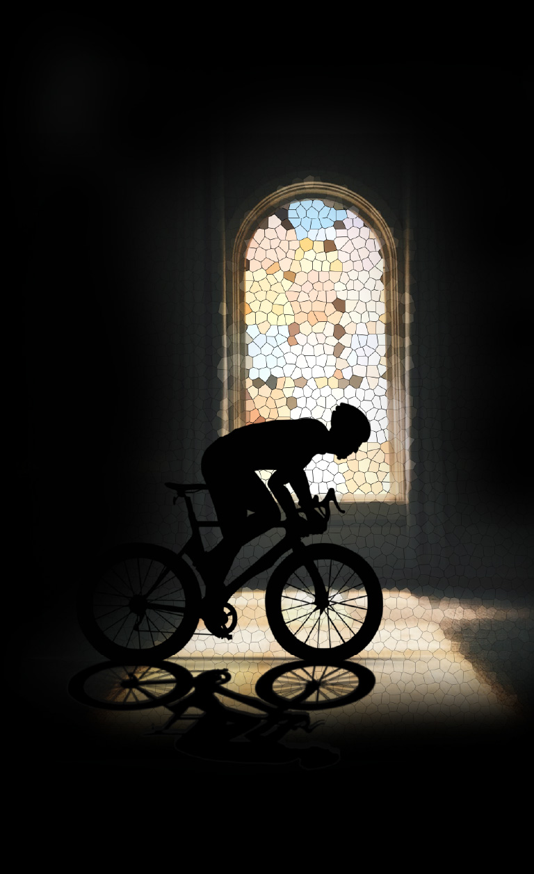
Cycling has held a revered status in Belgium since the 1920s, reaching its pinnacle of popularity in the 1950s and 60s. Local heroes who triumphed in races became idols, and the phrase "Cycling is religion" (in Dutch: "koers is religie") echoes strongly among Belgian readers, capturing the fervor and devotion associated with the sport.
...
The Challenge:
igniting the emotional connection with cycling
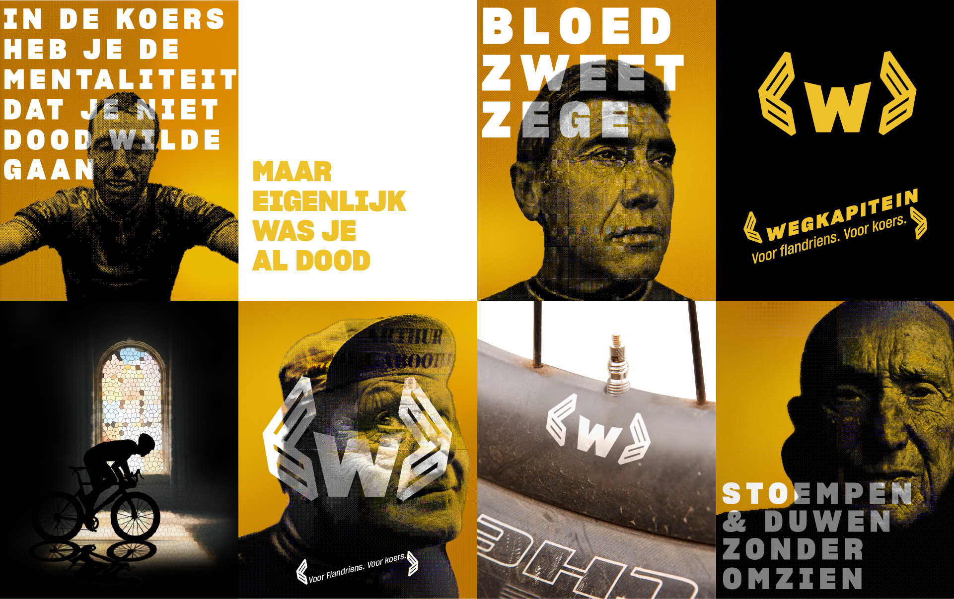
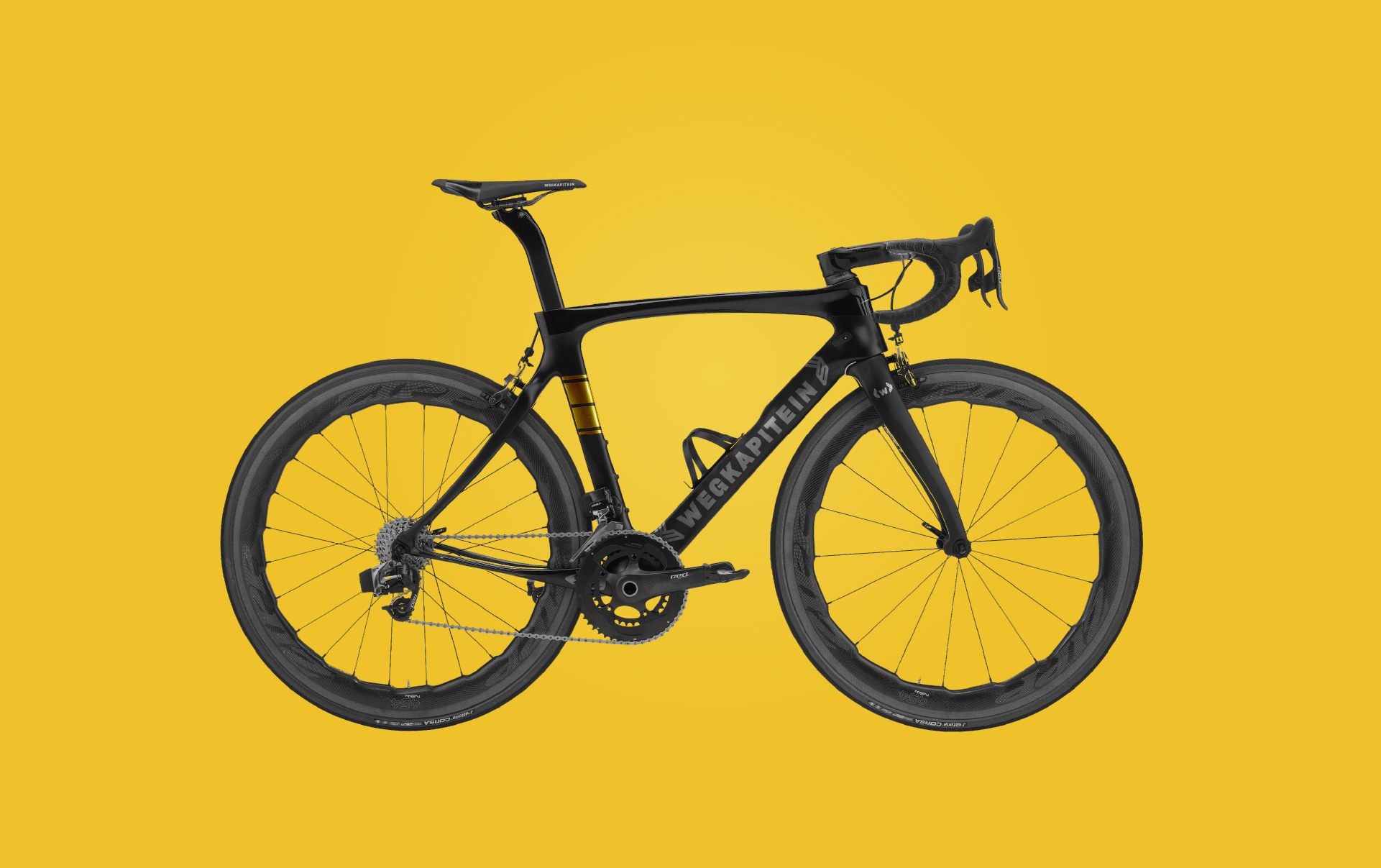
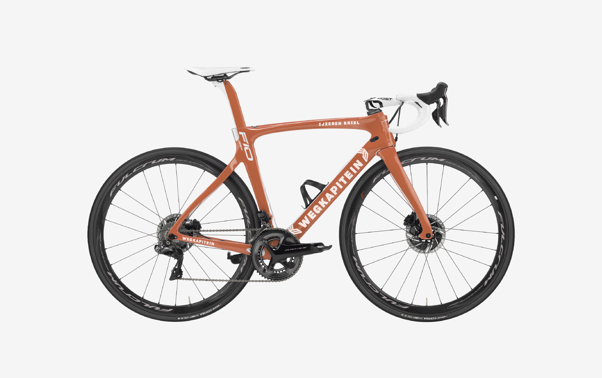
Wegkapitein Bicycles understands the profound sentiments that resonate within the hearts of cyclists—those familiar sensations of suffering, relentless perseverance, and unwavering dedication to crossing the finish line. Setting itself apart from competitors, the brand eschews the technical intricacies of its frames and instead focuses on fostering a deep emotional connection with the sport.
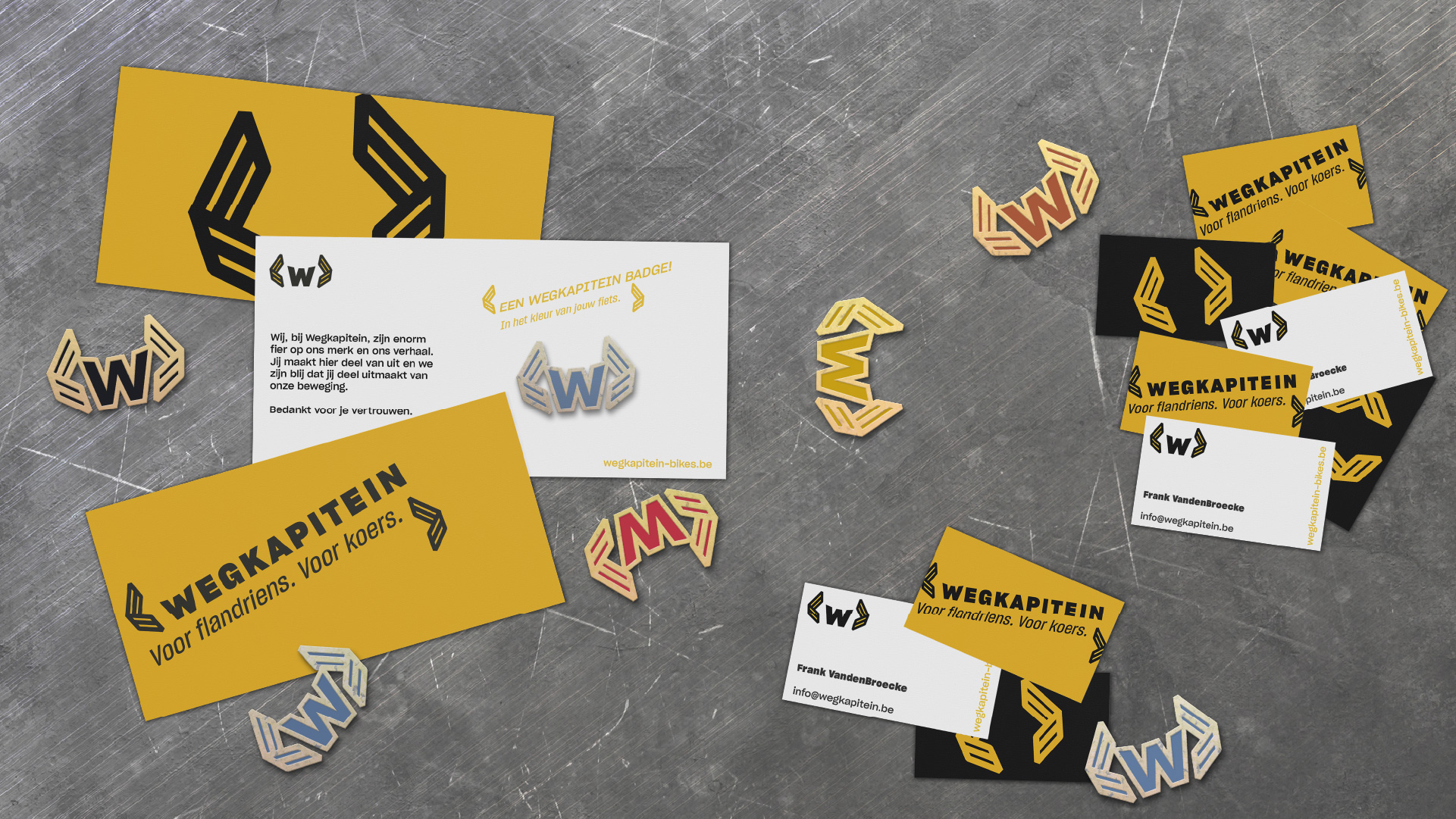
Wegkapitein emerges as an inclusive and progressive cycling brand curated for connoisseurs. The brand identity aims to embody these qualities in an attractive and approachable manner, effortlessly resonating with its audience without appearing forced. To achieve this, we drew inspiration from modernistic designs and reimagined them to align with the contemporary sensibilities of cycling enthusiasts.
What we did:
merging tradition and modernity
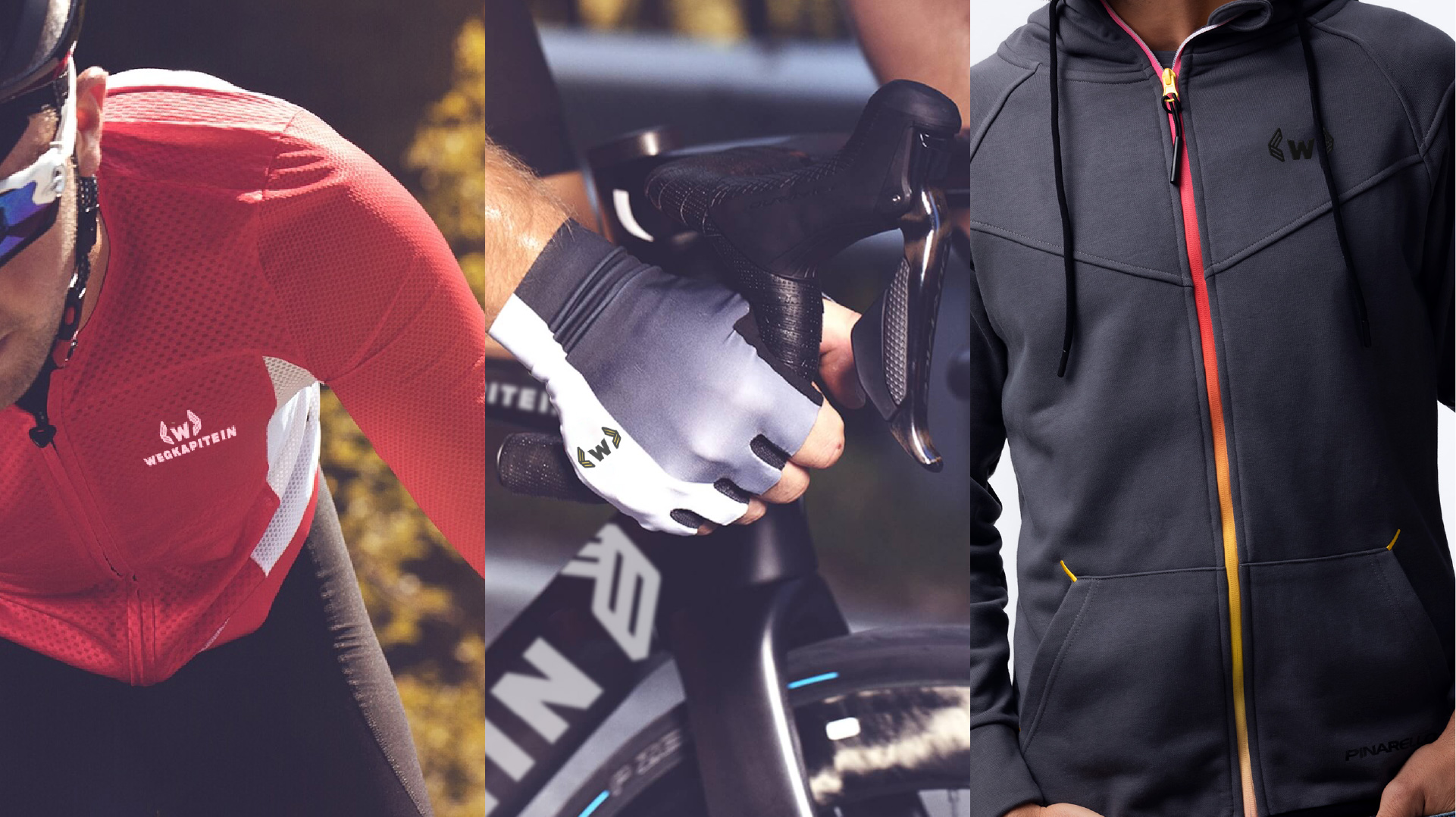
In capturing the spirit of Wegkapitein Bicycles, we embarked on a design journey that harmoniously blended tradition and modernity, paying homage to the heritage of cycling while capturing the attention of the present-day audience. Our approach aimed to strike a balance between allure and accessibility.
Drawing inspiration from the clean lines and geometric forms of modernistic design, we crafted a visual identity that exuded a contemporary appeal. The refined aesthetics and carefully chosen color palette seamlessly conveyed Wegkapitein's inclusive and progressive nature, appealing to both seasoned cyclists and newcomers to the sport.
While respecting the legacy of cycling as a revered "religion," we infused the brand identity with subtle nods to the rich traditions of Belgian cycle sports. This fusion of old and new formed a powerful emotional connection, tapping into the passion and dedication that drives cyclists.
Wegkapitein Bicycles now stands as a testament to the cycling religion, embodying the timeless ethos of suffering, determination, and triumph. Through its visually captivating and approachable identity, the brand invites connoisseurs to embrace the ride, honoring the legacy of cycling while embarking on a progressive journey into the future.