>Simplifying sanitary solutions for a carefree family life
In the realm of sanitary work, the current process often proves to be a hassle. Recognizing this, boiler maker aims to simplify the entire experience while promoting the values and benefits of a carefree family life.
...
The Challenge:
Revolutionizing the sanitary industry for ease and efficiency
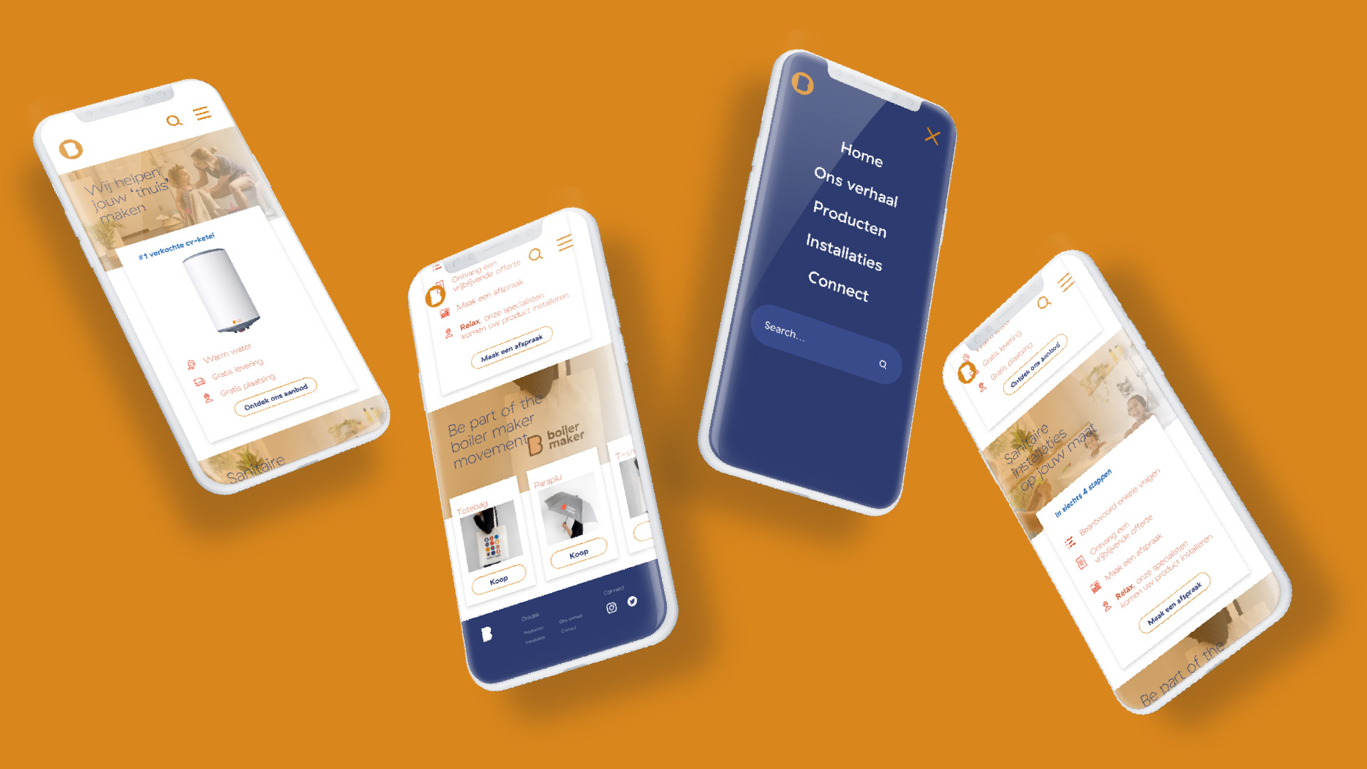
Their mission is to make life easier and more efficient by digitizing the entire sanitary process, offering a streamlined solution for everything from bathroom renovations to quick fixes in the kitchen sink. Through the introduction of a yearly subscription model, boiler maker offers the most bespoke and flexible approach within its business category.
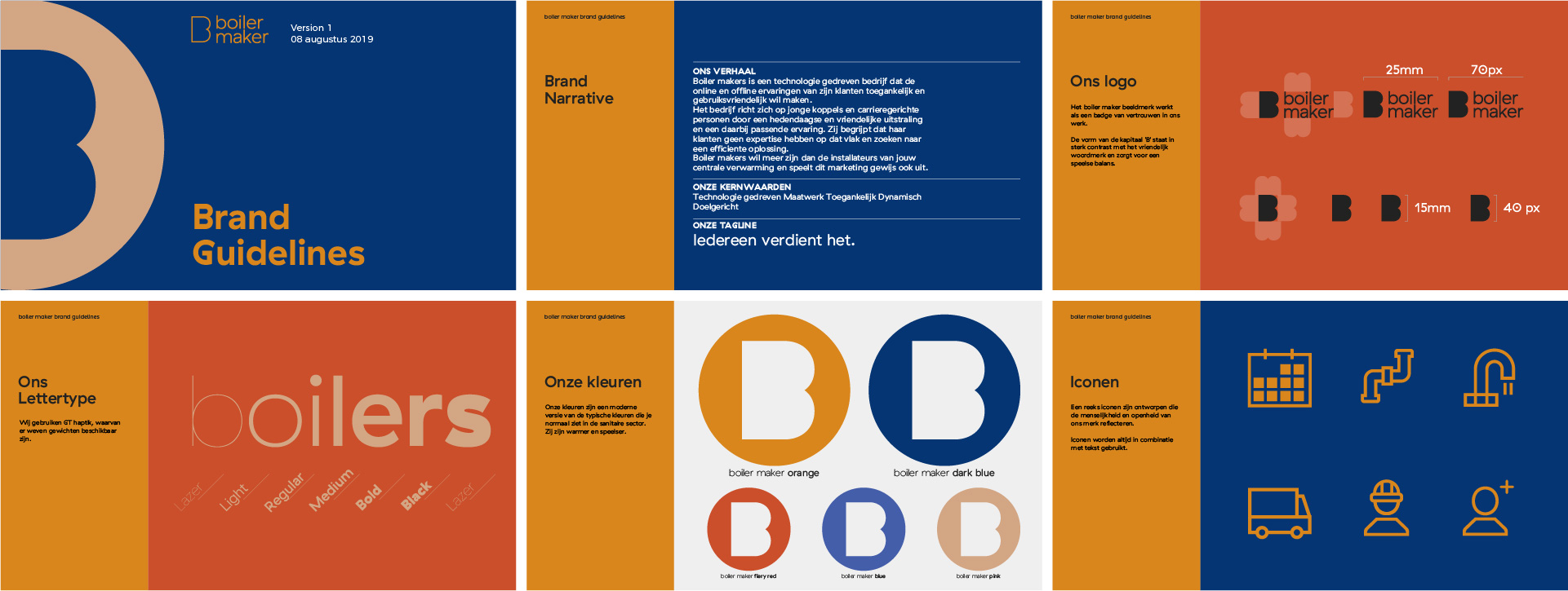
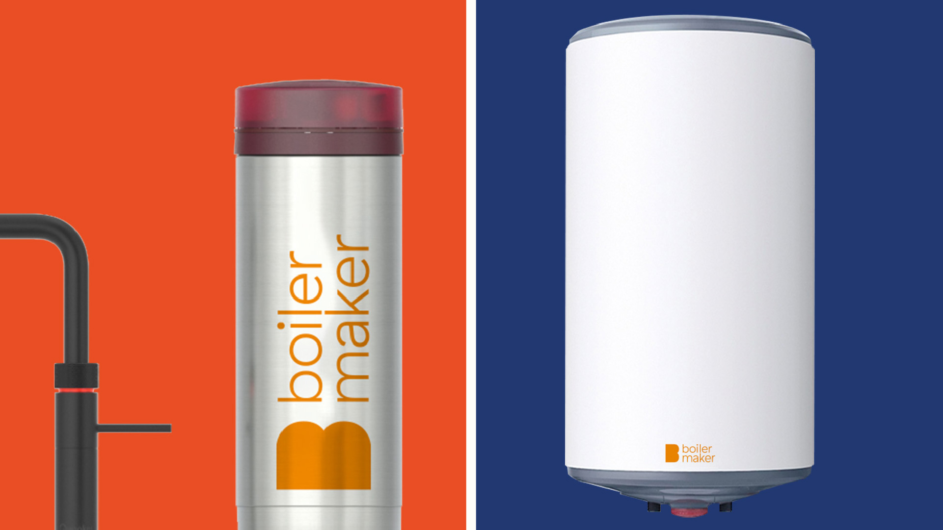
Upon examining the logos of various sanitary businesses in the area, it becomes evident that a common pattern emerges—flames, droplets, and the predominant use of red and blue colors. boiler maker seeks to transcend this conventional approach, elevating the sanitary industry to new heights and standing out among its competitors. Their brand and visual language must reinforce this commitment to innovation.
What we did:
embodying the spirit of carefree living
Understanding the core philosophy of boiler maker, we embarked on a creative journey that would capture the essence of their mission to simplify sanitary solutions while embracing the values of carefree living. We infused their brand with a distinctive visual identity that sets them apart in the industry.
We began by developing a tagline, "Everybody Deserves It," which directly aligns with the brand's philosophy and serves as a guiding motto in all their endeavors. This motto permeates every aspect of the brand, from the name to the typography, icons, and even the smallest details.
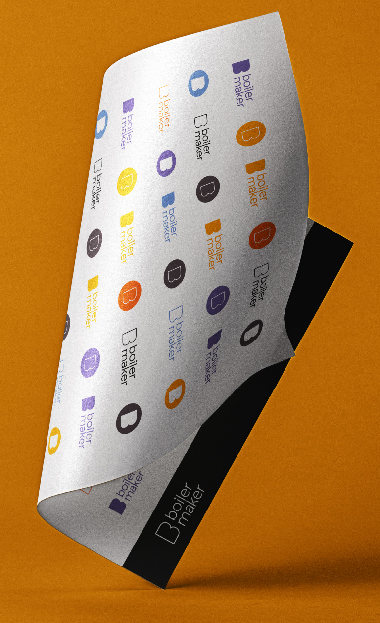
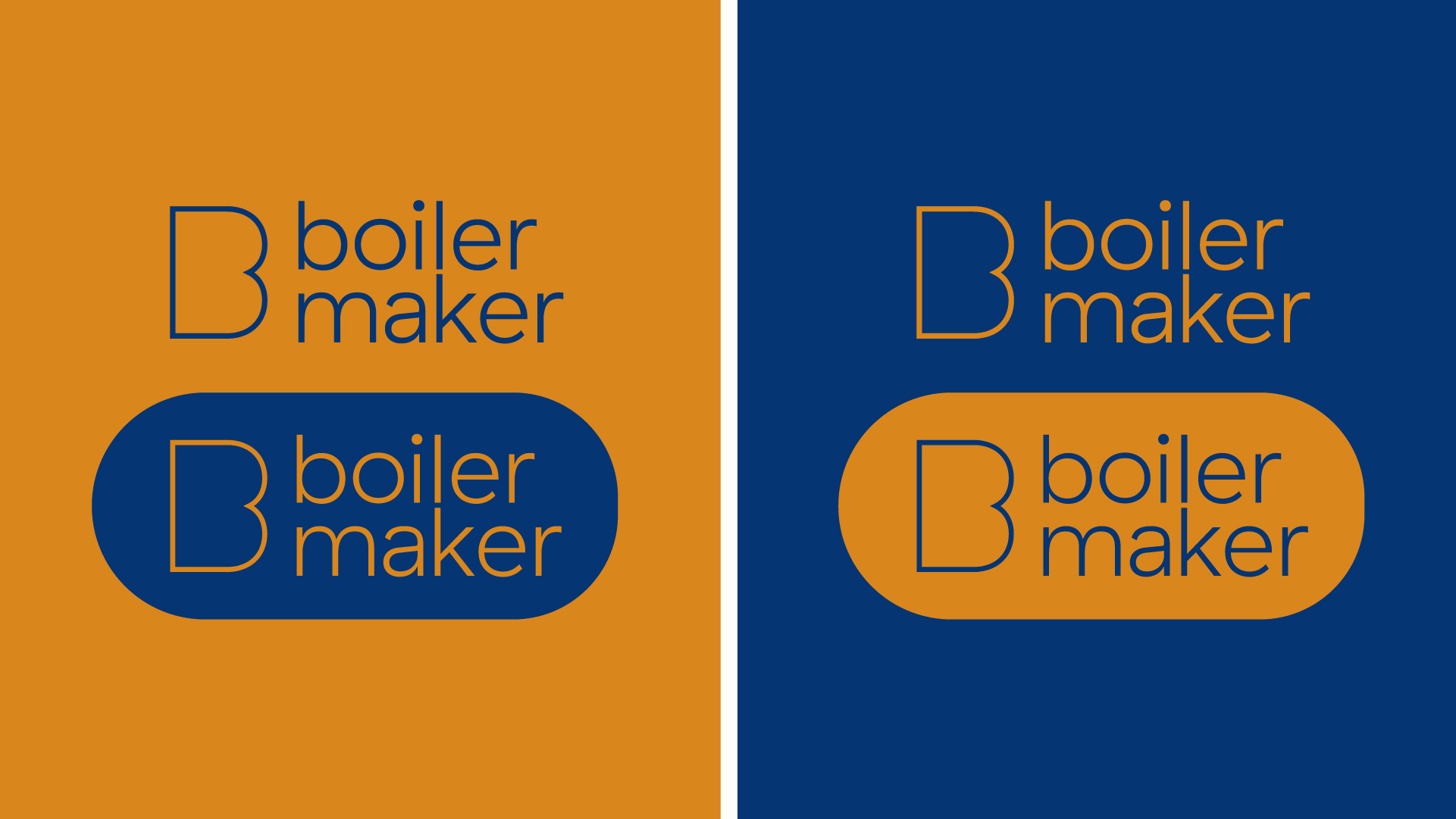
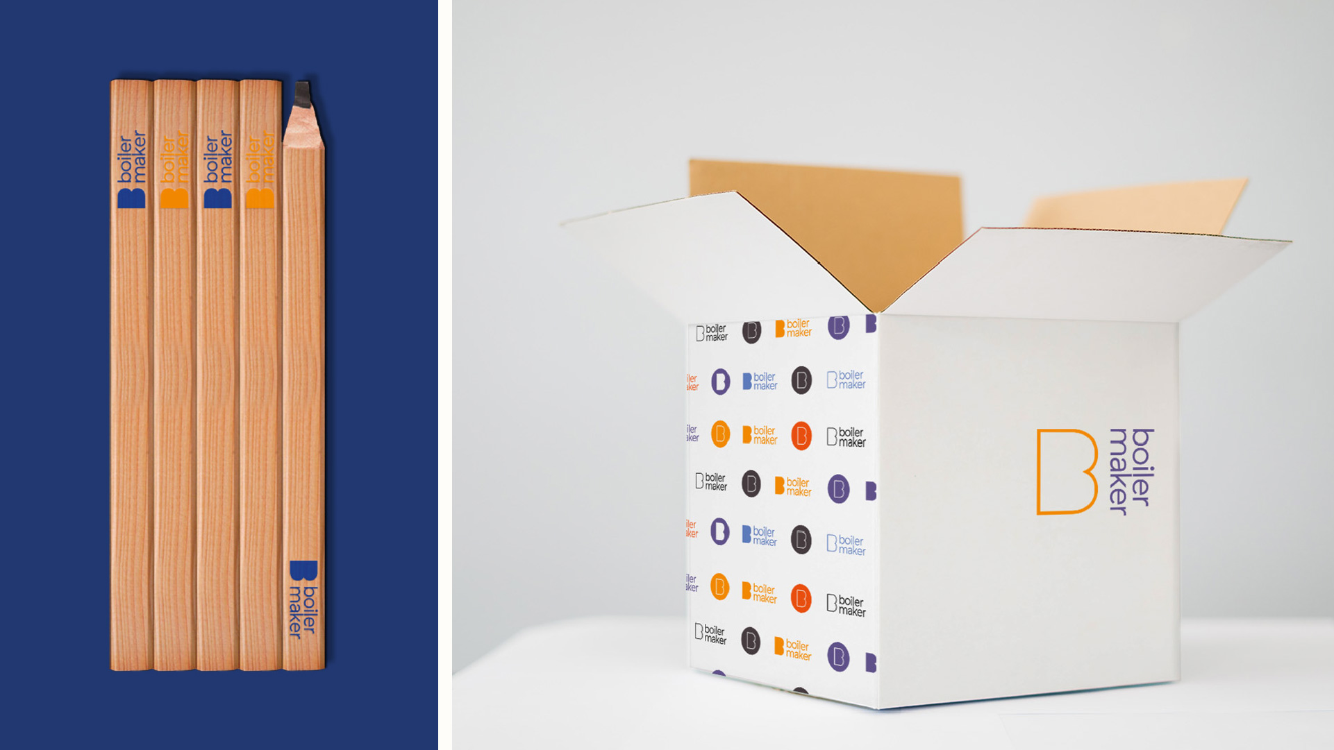
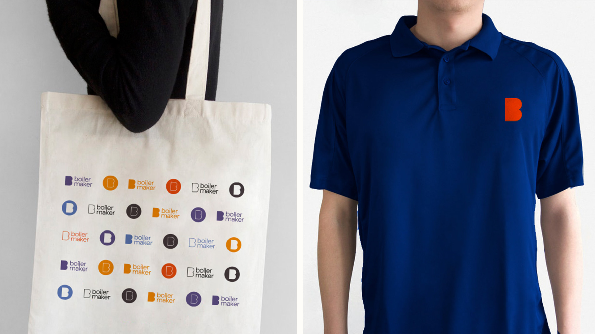
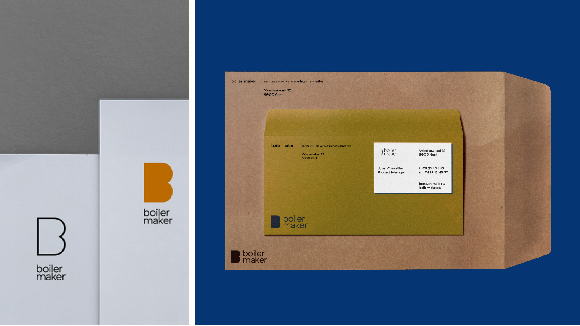
To break away from the traditional imagery prevalent in the sanitary industry, we crafted a unique visual language that combines modern aesthetics with a sense of warmth and approachability. The brand's logo reflects their commitment to revolutionizing the industry, using bold and contemporary design elements that stand out while exuding a sense of trust and reliability.
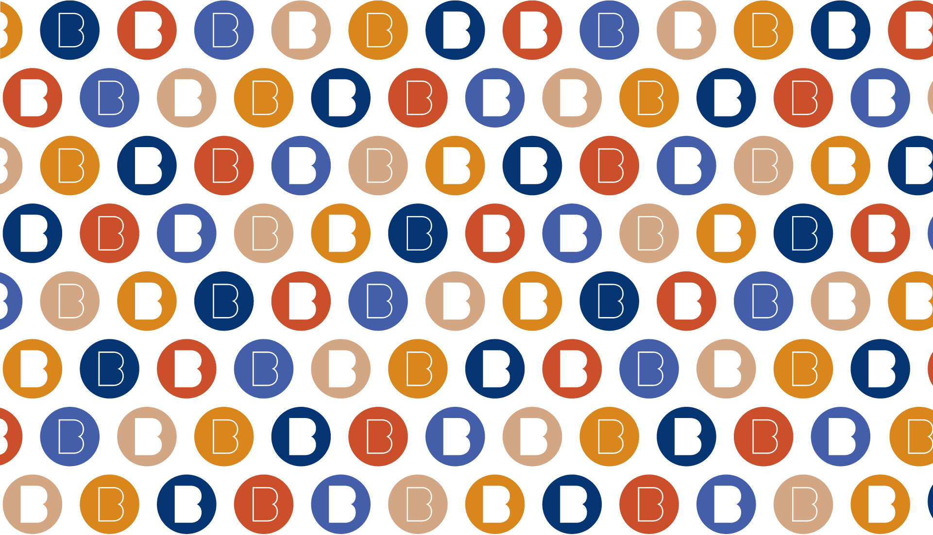
The color palette we selected deviates from the common red and blue hues, opting for a more sophisticated and refreshing combination that speaks to the brand's innovative approach. The typography we chose complements the overall design, striking a balance between clarity and personality.
Every touchpoint of the brand experience, whether it's the website, marketing materials, or customer interactions, embodies the spirit of carefree living and the ease that boiler maker brings to the sanitary process. Through meticulous attention to detail, we have created a cohesive and distinctive brand identity that resonates with customers and sets boiler maker apart as a trailblazer in the industry.
boiler maker now stands as a beacon of innovation, simplifying the sanitary experience and promoting a carefree family life. Their brand and visual language reinforce their commitment to excellence and distinction, ensuring that every interaction with boiler maker reflects their philosophy of making life easier and more enjoyable for all.